
As we know, the use of Microsoft Excel is increasing rapidly. Due to that every Excel user wants to learn more about the functions of Excel so that they can get more expertise in Microsoft Excel. But in this blog, we will discuss Pareto analysis which is a function of Excel. If you have any questions in mind such as what a Pareto chart in Excel is, how to create a Pareto chart in Excel, and what are the benefits of using Pareto chart in Excel.
Then Let me tell you, in the upcoming article, you will get familiar with all the information related to Pareto Chart in Excel. So let’s move on to the introduction part of the Pareto Chart of Excel.
What is Pareto Chart in Excel?
Pareto Chart is used by Excel experts to do Pareto analysis. This concept is introduced by Italian economist, Vilfredo Pareto. This analysis is based on the 80/20 rule which states that approximately 20% of the causes contribute to 80% of the effects.
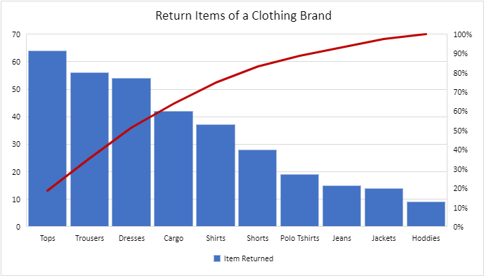
The Pareto chart is used for decision-making as it is a well-known concept in Project Management. The Pareto Chart looks like the mentioned image:
Various examples of the Pareto principle are given below:
- In language learning, around 80% of effective communication is achieved with 20% of a language vocabulary.
- In Quality Control, Roughly 80% of defects stem come from 20% of manufacturing errors.
- In Heath, around 80% of health benefits come from 20% of healthy habits.
So basically, the Excel User create a Pareto Chart to identify the most significant factor of a cause so that they can focus on the ways of improvement.
Note: Do read our other blog on 50 Shortcut Keys Of MS Excel for Boosting Your Excel Productivity.
How to Create a Pareto Chart in Excel?
To understand more clearly, it is very important to take an example for more clear understanding. For this, let’s take the example of returning items from a clothing store so that we can figure out which item causes the most trouble.
So let’s assume the following data for creating a Pareto chart in Excel.
But before creating the Pareto chart, do remember that the steps of creating a Pareto Chart are quite different in both versions of Excel.
| Note: The only way for users of Excel 2013 or older is to prepare the Pareto Chart in Excel from scratch manually. But for the new users of Excel 2016, the built-in charting tool of Excel is available. |
So in this blog, you will learn how to create a Pareto chart in Excel in both ways such as by using a Built-in charting tool or by creating manually. Let’s dive into the various steps on how to create a Pareto chart in Excel.
9 steps on How to Create a Pareto Chart in Excel 2013 and older versions
In the upcoming article, firstly we will discuss 9 steps of how to create a Pareto chart in Excel 2013 and the older versions by creating manually.
Well, you might have a question in your mind that creating manually will be a lengthy process. But let me tell you, in this older version you can customise your chart as per your suitability like adding the data labels and so on. However, users of versions prior to Excel 2016 have no other choice but they have to do all the work themselves.
For instance, a user can add the data labels to the Pareto line or markers and can change the Gap Width of the columns.
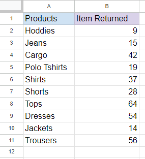
Step 1: Collect the Data & Insert in Cells
To learn how to create a Pareto chart in Excel 2013, 2010, and 2007, the first thing that you have to do is insert the data in Cells.
For example, Returned Items received by a Clothing Store.
An image showing the list of returned items.
Now let’s move to the next step.
Step 2: Sort the Data
In Step 2 of How to Create a Pareto Chart in Excel 2013 or older versions, after inserting the data in the cells, sort the data in descending order. For doing the same, Select the Data and Go to the Data Option mentioned in the Excel Ribbon.
Moving further, Go to the option custom sort and change the settings to Descending Order under the order option.
The option will look like this:
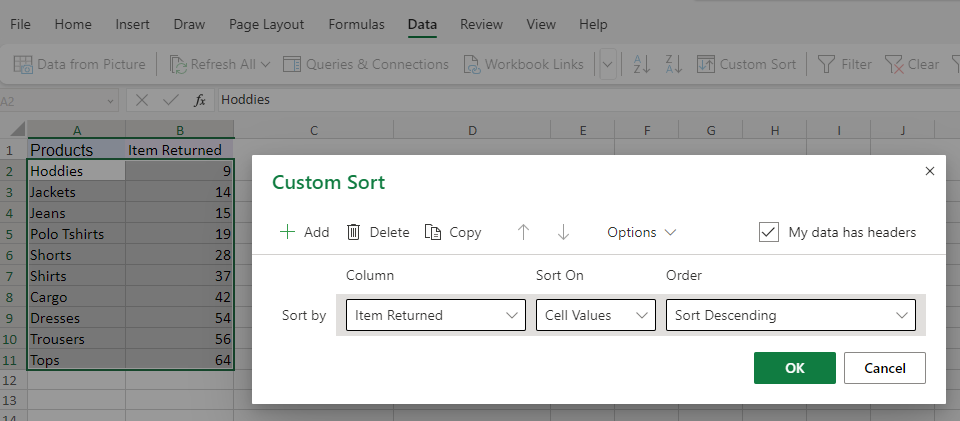
An image showing the custom sort option.
After selecting the Column “Items Returned”, sort on the option to “Cell Values”, and order to “Sort Descending”. Tap Ok.
Now, the cells in the data will look like this:
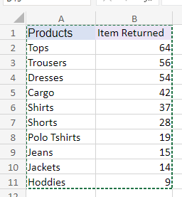
An image showing the list of returned items in descending order.
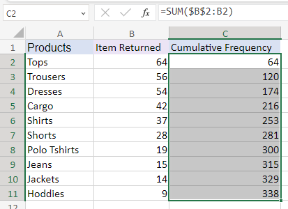
Step 3: Calculate the Cumulative Frequency
Moving further, the next step of how to create a Pareto card in Excel 2013 or older version is to calculate the percentage of category that is the cause of the problem.
For example, in our assumed data the cause of the problem is the number of items returned by users in a clothing store.
For calculating the cumulative Frequency use the formulae shown in the below image.

An image showing the formula for calculating the cumulative frequency
After this, Drag this formula Across the cells C3:C11 to get the running total of the remaining frequencies in column B. It will appear as this:
An image showing the remaining cumulative frequency by using drag & drop way.
Step 4: Calculate the Cumulative Percentage
Calculating the Cumulative Percentage is the fourth step of how to create a Pareto Chart in Excel. So after calculating the cumulative frequency, calculate the cumulative percentage with the formulae shown in the upcoming image.
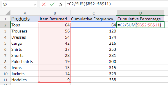
An image showing the formula for calculating the cumulative percentage
To Move further! Now drag this formula down across the cells D3:D11 so that we can get the cumulative frequency percentage of remaining cells of Column D, to proceed with our Pareto chart. But for doing the same, you can also use a keyboard shortcut i.e, Ctrl + D.
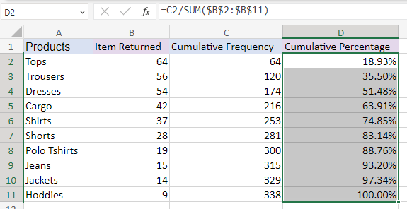
An image showing the remaining cumulative percentage by using drag & drop way.
Step 5: Convert the data into Cumulative Percentage form
If the data under the cumulative percentage column is not in the percentage form. Then do select the cells D2:D11 and navigate to the Number Formatting group under the Home tab, where you can see the Percentage Style button. Now, click on the button to change the style of cells as a percentage. Furthermore, you can also use Ctrl + Shift + % shortcut to achieve the result.
Now, let’s move on to the next step.
Step 6: Select the Data & Prepare the Chart
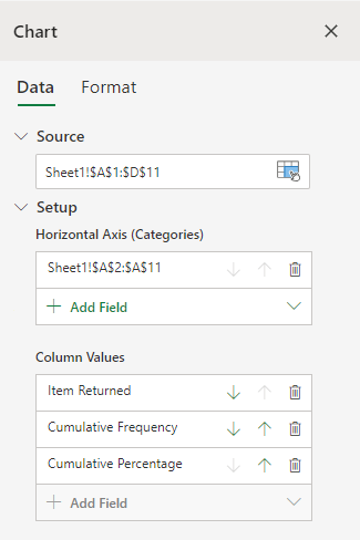
Select either the Data of Columns A, B, and D or select the data of all the cells. After this navigate to the Insert Tab through the Excel ribbon. Well, preparing the chart is the next step of how to create a Pareto chart in Excel.
Now select the Recommended Chart option which is given under the Charts group. After this, you will see all the charts which can be used to represent this data visually.

An image showing recommended charts option.
Now click on the All Charts tab in the Recommended Chart window. Here, you can see a list of charts available.
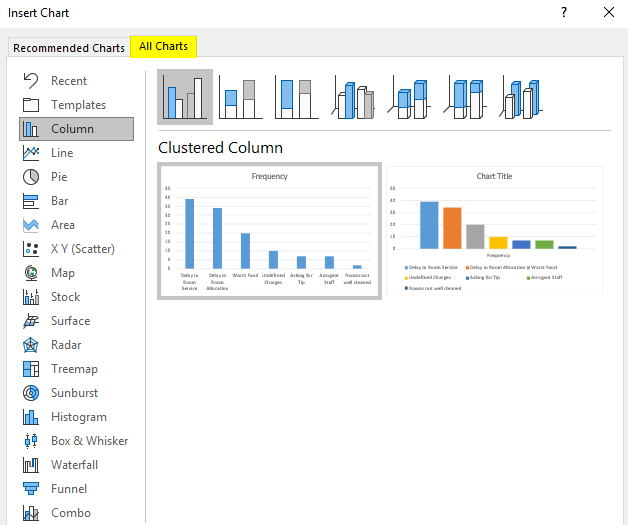
An image showing different chart options.
Here, select the Clustered Column Chart and the chart will appear on the screen like this.
Also Read: 6 effective steps on How to Create a Clustered Column Chart in Excel?
An image showing clustered column chart of selected data.
Remember! The chart will only look like this if you select all the data. But for creating a Pareto chart, we need only two columns: items returned and the Cumulative Percentage. So for correcting this, select the Chart and Right click on the screen. After this, go to the format option. In the settings, under the Data option delete the option cumulative frequency under the column values.
An image showing different chart options.
After correcting the settings, the chart will appear as this:

An image showing the chart after doing the correction.
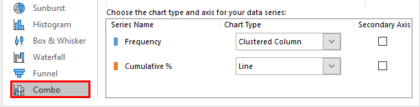
Now in the Change Chart Type dialog box, transform the clustered bar graph into a combo chart. After this, move towards the Combo option that is visible on the left-hand side of the screen present in front of you. Furthermore, select Custom Combination under it, to customize the chart.
An image showing custom combination options.
Now, under Custom Combination, select the required chart type and tick the Secondary Axis option for the Cumulative % series. Due to this, the Cumulative % values will be plotted on the Secondary Axis. Click on the OK button after you select all the required options.
After doing this, the result will appear as:

How to create a Pareto chart in Excel? Now we can say, by implementing all these steps in serial order, you will get a Pareto chart of the raw data that you inserted in the cells in the beginning.
Step 7: Use the Format Axis option
While preparing a Pareto chart, right-click on the Secondary Axis Values on the Graph. After this, choose the Format Axis option. Now, a new Format Axis pane will open up on your screen at the rightmost side of the Excel sheet.
Your screen will look like this:
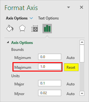
Now under Axis Options, change the Maximum Bound Value to 1.0. After this, it automatically set to 1.2, which means 120%.
Step 8: Change the Gap Width of the Columns
This is another step of how to create a Pareto Chart in Excel. To begin, to format the data series right click on any of the bars. After this, choose the Format Data Series option at the end of the list of options.
Moving further, you can see that on the right-hand side, the Format Data Series window will open in Excel. Under the Series option, go to the Gap Width option. In this option, you can change the gap width to, say 0.5% so that the bars get close to each other.
For instance, I change the gap width to 0.1% because I want the bars should get close to each other.
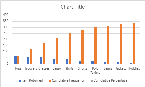
This setting is specially done to reduce the gap between the bars of our Pareto Chart. Now, the chart will look like this:
An image showing Pareto Chart after the settings
Step 9: Customise the Pareto Chart
For customising the Pareto Chart, you can use various options such as:
- Change the colour of the Cumulative Percentage Line Series
- You can add a chart title
- You can also add Data Labels, as per your suitability
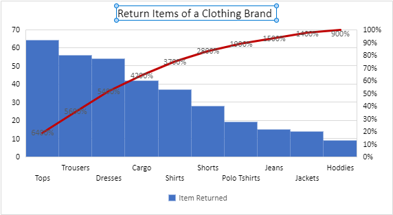
After customisation, your Pareto Chart will look like this:
An image showing Pareto Chart after the customisation
Now based on our Pareto Chart, we can conclude that more than 60% of the item returns are of products: Tops and Trousers. Therefore, these are the major areas we should keep improving for less returns and better customer feedback and reviews.
In Excel 2013 or older versions, you can create a Pareto chart by using these above-mentioned 9 steps in serail-wise order. Now let’s discuss, how to create a Pareto Chart in Excel 2016+
Also Read: 9 Effective Ways to Use Microsoft Excel in Business
5 steps on How to Create a Pareto Chart in Excel 2016+
Now let’s discuss, how an Excel user can create a Pareto Chart in Excel 2016+ versions of Microsoft Excel.
In Excel 2016+ versions, creating a Pareto Chart is pretty fast compared to Excel 2013 or older versions. Because it takes only a few clicks to set up the chart. But in this, you lose out on some customisation features.
For instance, if a user is using Excel 2016 or newer versions for creating the chart, they can not add either the data labels or the markers to the Pareto line.
So, if you want to use this feature, you have to do an extra level of customisation by building the chart from the ground up. But here are some steps for those who want to take the easier route.
Step 1: Plot a Pareto Chart
Plotting a Pareto Chart is the first step of how to create a Pareto chart in 2016+. So to understand this, let’s take the same example “Returned Items received by a Clothing Store”.
An image showing the list of returned items.
Do follow these simple steps to make a Pareto graph in Excel 2016+
- Select your table. In most cases, it is sufficient to select just one cell because Excel will pick the whole table automatically.
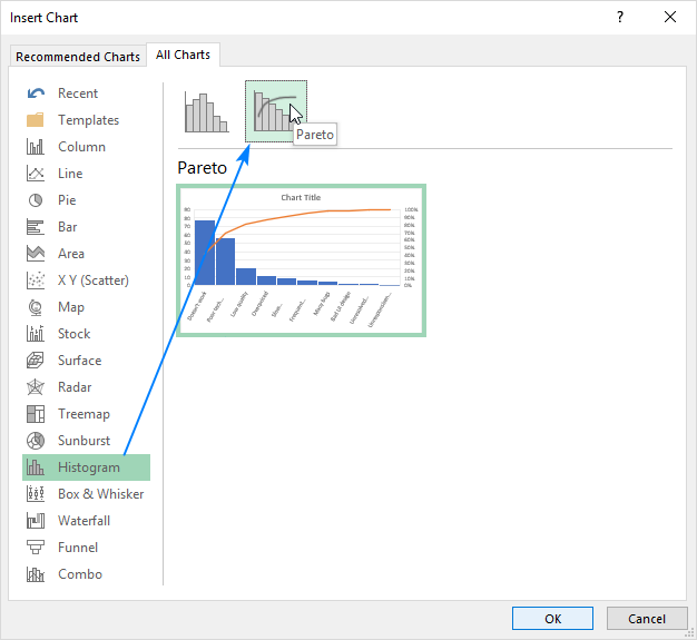
- On the “Insert” tab. Go to the “Charts” group and click “Recommended Charts”.
- Switch to the “All Charts” tab, select “Histogram” in the left pane, and click on the Pareto thumbnail.
- Now, Click OK.
The above-discussed options will appear as this:
An image showing the direct Pareto Chart option under All Charts
As soon as you follow these steps and tap ok, your chart will look like this:
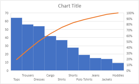
An image showing the Pareto Chart
Step 2: Customise Pareto Chart Graph: Add Designing
As soon as Pareto Chart appears on the screen you can start customising it. Customising the Pareto Chart is the next step of how to create a Pareto Chart in Excel in 2016+ versions.
To begin, click anywhere in your Pareto chart. Go to the Chart Tools option appearing on the Excel ribbon. After this, switch to the Design tab. As soon as you do this, you can experiment with different chart styles and colors.

An image showing different chart types and colors
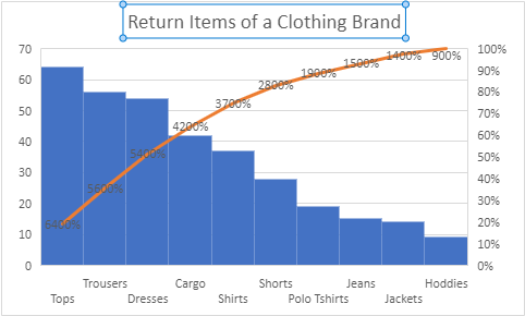
Step 3: Customise Pareto Chart Graph: Add Data Labels
For adding the data labels, Right Click on any of the tables and select “ Add Data Labels”. Your Pareto Graph will look like this now:

An image showing Pareto Chart with data labels
Step 4: Customise Pareto Chart Graph: Add Chart Title
This is another step of how to create a Pareto Chart in Excel 2016+. Now give your Pareto Graph a Chart Title so that it will become easy for the user to make conclusions on the area where the improvement is needed.
An image showing Pareto Chart with the chart title
The Pareto Graph will look like this after the user adds the chart title.
Step 5: Customise Pareto Chart Graph: Add Final Touches
This is the last step of how to create a Pareto Chart in Excel 2016+. Now before saving and sharing your Graph, do the final touch-ups like
- You can use Black Outline in your Axes and Title
- Use Legends options or change the Legend position
- To make the chart more attractive you can change the outline color of the Cumulative Percentage Pareto Line
- Change the Gap Width of the columns, and so on
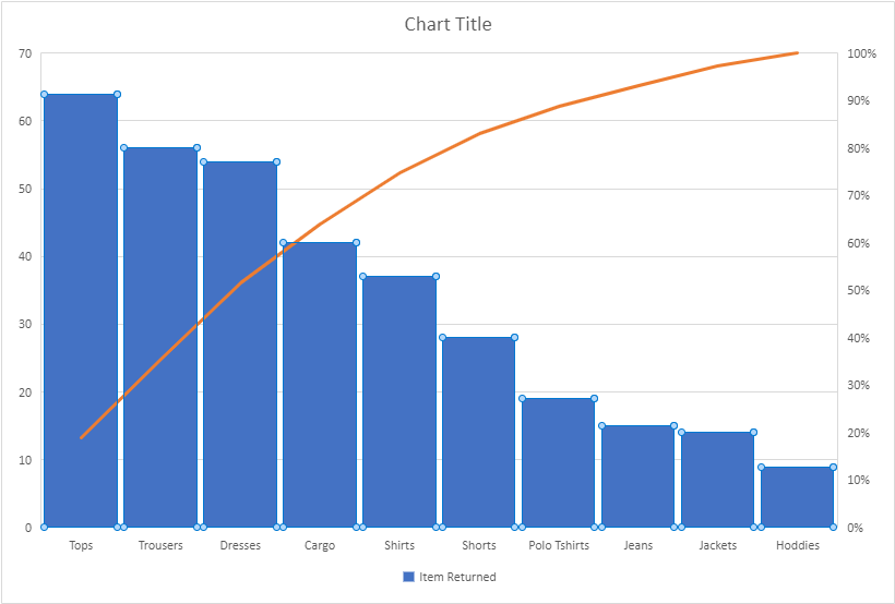
So, after doing all the customising. Your Pareto Graph will look like this:
An image showing the Pareto Chart after all the customisation
So these are the 5 steps of how to create a Pareto Chart in Excel 2016+. By following all these steps in serial order wise, you will get a Pareto Graph for analysis. Now based on our Pareto Chart, we can conclude that more than 60% of the item returns are of products: Tops and Trousers. Therefore, these are the major areas we should keep improving for less returns and better customer feedback and reviews.
Important Things to Remember About Pareto Analysis in Excel
Do remember the below-mentioned information about Pareto Analysis in Excel.
- Pareto Analysis is also known as the 80/20 Principle.
- Take only data values and cumulative percentages for creating a Pareto Graph Chart.
- Do sort the data values in descending order before selecting the Chart option.
- Do not consider the cumulative frequencies while preparing the Pareto Chart.
- Customise your Pareto Graph Chart for better analysis and clear understanding.
Final Words
In this blog, we have discussed how to create a Pareto chart in Excel using both the versions and some important things that you remember while preparing the Pareto Graph Chart.
Well, the Built-in feature of newer versions is quite easy but you have to do all the customisation by yourself. But if a user uses an older version of Excel for creating the Pareto Chart then they can benefit from the customisation feature. Before coming to the conclusion of which version is suitable for you? Let me tell you, both ways give an attractive Pareto Graph Chart for analysis.
The main advantage of creating a Pareto Chart is that a user can find out the cause of the problem and can rectify the major issues to increase organizational efficiency. Furthermore, Pareto Analysis is also helpful in better decision-making.
I hope all the information mentioned in this blog will be helpful to you while creating a Pareto Chart. For more related articles, do visit our website again. Thank you for Reading our Blog till the end.
Frequently Asked Questions (FAQs)
1. What is Pareto Chart in Excel?
Pareto Chart in Excel is prepared by the Excel user to analyse the cause of the problem. As the Pareto chart is based on the 80/20 principle which states that 80% of the effects come from 20% of cause. Pareto Analysis is done to reduce the problems that are coming to improve productivity.
2. What are the important things to keep in mind while preparing a Pareto Chart?
The important thing to keep in mind while preparing a Pareto Chart is to remember that a Pareto Chart is based on the 80/20 principle. Furthermore, Pareto Chart is prepared by selecting the data and the cumulative percentage.