Well, Do you want to ease your work by using MS Excel effectively? Or do you want to learn more about MS Excel? If your answer is yes, then let me help you to get answers to your questions like how to create a clustered column chart in Excel. Furthermore, you will also get familiar with the merits and demerits of clustered column chart in Excel.
In addition to this, if you’re looking to present your data in a clear and visually appealing manner, creating a clustered column chart in Excel can be an excellent choice. This type of chart is particularly useful when you want to compare values across different categories. So, in this article, we’ll guide you through 6 steps on how to create a clustered column chart in Excel, step by step.
Hold On! Before moving further, it is very essential to discuss what is Clustered Column in Excel. So, let’s get started.
Note: Do read our other blog: How to Make a Graph in Excel with Multiple Lines with 6 effective steps.
What is a Clustered Column Chart in Excel?
You might be eager to know how to create a clustered column chart in Excel. But before coming to the main part let’s discuss what is a clustered column chart in Excel.
To begin, Clustered Column Charts are one of the simplest and most commonly used chart types in Microsoft Excel. It visually represents data using vertical columns that are grouped together. Each column in this chart represents data in a category or sub-category. Furthermore, it also represents each column’s height corresponding to the value.
The columns in this type of chart are grouped together side by side, which form clusters and each cluster in a chart represents distinct data series. That’s why it is said that Clustered column charts are ideal for comparing values across different categories. Each category is represented by a column, and the columns are clustered together for easy comparison.
For example, We have four companies here such as Company A, Company B and so on. And the number of employees is also shown corresponding to each company. By looking at the figure we get to know that Company B has the highest number of employees. The following figure shows the simple column chart of different companies.
 |
Keep in Mind! Column Charts are commonly used to represent data in columns and in making comparisons. A chart that shows vertical columns are known as Column Chart and a chart that shows horizontal columns are known as a Bar Chart.
6 Steps of How to Create a Clustered Column Chart in Excel
In this blog, we will guide you through 6 steps of how to create a clustered column chart in Excel. So let’s get started:
Step 1: Organise your data
We will take the example of a multiple clustered column chart. Firstly, organise the data correctly in the rows and columns. In a manner, that the data should be in table form. Each row and column represents a different point and different category.
We will take the example of the Quarterly Performance of Employees of different companies.
 |
In the example, the dataset displays the company’s quarterly performance of employees from different countries. The objective is to compare the performance figures generated in each quarter. In terms of data preparation and forming a clustered column chart in Excel, you need to ensure a streamlined dataset.
Step 2: Select your data
Moving further to the next step of how to create a clustered column chart in Excel, once the data is organised. Do select the data that you want to include in the clustered column chart. To do this, simply drag the mouse over the cells that contain the dataset. In addition to this, you can also highlight the cells containing the data you want to include in the chart. Be sure to select both the categories and the values.
 |
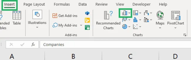
Step 3: Insert the Column Clustered Chart
After organising and selecting the data in the cells. Follow these steps:
- Go to “Insert”.
- After that click the Column symbol.
- Choose a clustered column chart. You can choose either a 2D or 3D chart.
We are going with the 2D chart for now. This is the 3rd step of how to create a clustered column chart in Excel.
 |
After the 3rd step of inserting the column clustered chart. You will get results like the one shown below:
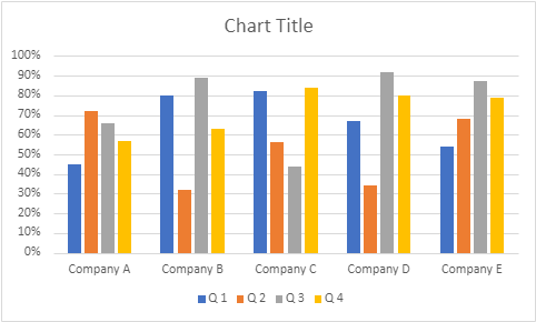 |
Here it is, Excel makes the clustered column chart out of our dataset.
Step 4: Customizing the Chart Title and Legend
As you can see, it is mentioned in the image “Chart Title”. Here, you can add the chart title and can also change the settings of Legend in Excel.
For doing this, you can click on the chart title and edit it to reflect the content of your chart. You can also customize the horizontal and vertical axes titles to make the chart more informative. This is another step of how to create a clustered column chart in Excel.
 |
 |
Step 5: Customise your Clustered Column Chart
For customising the clustered column chart and making it more attractive. There are a number of options for customising the clustered chart in how to create a clustered column chart in Excel and these are as follows:
- Formatting the Columns
Right-click on the columns in the chart and choose “Format Data Series.” Here, you can adjust the gap width between the columns to make the chart visually appealing.
- Adding Data Labels
Data labels provide precise information about each column. Right-click on the columns, choose “Add Data Labels,” and select whether you want the values, percentages, or both to be displayed.
- Adjusting Axis Labels and Title
To enhance clarity, format the axis labels to make them more readable. Additionally, customize the axis title to provide context to your chart.
- Changing Column Colors
You can change the colors of the columns to differentiate between categories. Right-click on a column, choose “Format Data Series,” and navigate to the “Fill” option to change the color.
- Fine-Tuning Your Chart Styles
Explore other formatting options to fine-tune your chart’s appearance. You can adjust gridlines, legends, and other elements to optimize the visualization.
Step 6: Saving and Sharing your Chart
Last but not least, the most essential step is to save your Excel file. To share it with others, you can simply attach the file to an email or upload it to a cloud storage service. After this, both you and others can compare the data of different company’s quarterly employee performances.
Saving and Sharing your Chart is the last step of how to create a clustered column chart in Excel. Because after this any data user can make the comparisons and make conclusions as per the analysis
Note: Also Read 50 shortcut keys of MS Excel to boost productivity.
Merits and Demerits of Clustered Column Charts
I hope now you know how to create a clustered column chart in Excel. Moving further, let’s discuss the various merits and demerits of clustered column charts in Excel.
Clustered column charts are a popular data visualization tool in Microsoft Excel, widely used for comparing values across different categories. While they offer several merits, they also come with demerits. Let’s explore the merits and demerits of clustered column charts.
Merits:
- Clear Comparison:
Clustered column charts provide a clear and straightforward way to compare data points within each category. Neatly organized columns allow the user for easy visual comparisons.
- Effective for Small Data Sets:
These charts are particularly effective when dealing with small to moderate-sized data sets. They present data in a concise manner, making it easier to identify trends and patterns.
- Simple Interpretation:
The simplicity of clustered column charts makes them accessible to a wide range of audiences. Viewers can quickly grasp the information presented without the need for complex explanations.
- Category Emphasis:
These charts are especially useful when you want to emphasize the differences between categories. They highlight variations in values and allow for quick identification of the largest and smallest values.
- Compatible with Categorical Data:
Clustered column charts work well with categorical data, where distinct groups or labels exist. They excel at showing how different categories compare to one another.
- Customizable:
Users can customize the appearance of clustered column charts by adjusting colors, labels, titles, and other formatting options. This flexibility allows for better alignment with specific design preferences.
Demerits:
- Limited for Large Data Sets:
As the number of categories or data points increases, clustered column charts can become cluttered and challenging to interpret. They are less effective for displaying extensive data.
- Limited Trend Analysis:
While clustered column charts help compare values within categories, they may not be the best choice for showcasing trends over time or relationships between variables.
- Space Constraints:
If category labels are lengthy or numerous, space constraints can lead to truncated labels or a crowded appearance, diminishing the chart’s readability.
- Difficulty in Data Comparison:
Comparing data across different categories can sometimes be challenging, especially if the values are close in magnitude. The visual distinction between columns may not be pronounced.
- Not Ideal for Continuous Data:
Clustered column charts are better suited for discrete or categorical data. Continuous data, such as temperature readings or time intervals, might not be presented effectively.
- Risk of Misinterpretation:
Depending solely on visual comparison can sometimes lead to misinterpretation, especially when the columns have slight differences in height.
Conclusion
In this Blog, we have discussed how to create a clustered column chart in Excel and its various merits and demerits. I hope the information related to the steps of how to make a clustered column chart in Excel will help you while you create one.
To conclude, we can say that clustered column charts are a valuable tool for visually representing and comparing data across categories. They offer simplicity, clarity, and customization options, making them suitable for various scenarios. However, it’s essential to consider their demerits, particularly when dealing with extensive or continuous data sets. To maximize their effectiveness, choose the appropriate chart type based on your data and communication goals.
Do visit again for more related content on Ms- Excel.
Frequently Asked Questions (FAQs)
Is it possible to create 3D clustered column charts?
Excel also offers 3D chart options but it’s recommended to use 2D charts like clustered columns for better clarity.
Can I create a clustered column chart with multiple data series?
Yes, you can represent multiple data series in a clustered column chart.